Bridging the gap between concept and execution
Virtusa Mobile App

Virtusa Mobile App
Role: UI/UX Designer
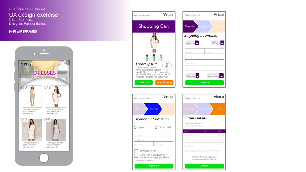
This is a redesign of the mobile checkout form for a new user at an eCommerce site to make it more usable and enjoyable and to reduce the likelihood of errors.
Thinking about the problem from a user’s point of view, I’ve determined how to improve the design through effective information architecture, interaction design, and visual design.
User Story:
Samantha, a 34 year-old mother, is in an airport waiting to board a flight to Colorado for vacation. She has some time to kill before her flight, so she does some impulse shopping online and buys a dress at a leading fashion website. This is her first time purchasing anything on the site. Since she’s going on vacation for a week, she wants the product to be delivered after she arrives back home.
Samantha has initiated the checkout process after viewing the dress in her cart. She needs to fill out the checkout form, which contains billing/shipping and payment info. Once she provides that information, the site will enable her to review the information before submitting the transaction. You’ll find the basic form here: https://auzytt.axshare.com/us_iphone.html


